Cohort Analysis using Python
Cohort Analysis is a data analysis technique used to gain insights into the behaviour and characteristics of specific groups of users or customers over time. If you want to learn how to perform Cohort Analysis, this article is for you. In this article, I’ll take you through the task of Cohort Analysis using Python.
Cohort Analysis: Process We Can Follow
Cohort analysis is valuable for businesses as it allows them to understand user behaviour in a more granular and actionable way. Below is the process we can follow for the task of Cohort Analysis:
- The first step is to define the cohorts based on a specific characteristic or event. For example, in an e-commerce platform, cohorts could be defined based on the month of a user’s first purchase.
- Gather relevant data for analysis.
- Determine the time intervals you want to analyze.
- Group users into cohorts based on the defined characteristic or event.
- Choose the key performance metrics you want to analyze.
- Calculate the chosen metrics for each cohort over the specified time periods.
- Create visualizations to present your findings effectively.
A dataset for Cohort Analysis typically includes user or customer data, such as registration date, purchase history, engagement metrics, or any other data points relevant to the analysis. I found an ideal dataset for this task. You can find the dataset here.
Cohort Analysis using Python
Now, let’s get started with the task of Cohort Analysis by importing the necessary Python libraries and the dataset:
import pandas as pd

data = pd.read_csv("cohorts.csv")
print(data.head())
Date New users Returning users Duration Day 1 Duration Day 7 0 25/10/2023 3461 1437 202.156977 162.523809 1 26/10/2023 3777 1554 228.631944 258.147059 2 27/10/2023 3100 1288 227.185841 233.550000 3 28/10/2023 2293 978 261.079545 167.357143 4 29/10/2023 2678 1082 182.567568 304.350000
Now, let’s have a look at whether the dataset has any null values or not:
missing_values = data.isnull().sum()
print(missing_values)
Date 0 New users 0 Returning users 0 Duration Day 1 0 Duration Day 7 0 dtype: int64
Now, let’s have a look at the datatypes of all the columns in the data:
data_types = data.dtypes
print(data_types)
New users int64 Returning users int64 Duration Day 1 float64 Duration Day 7 float64 dtype: object
The Date column is in object (string) format. For effective analysis, especially in cohort analysis, we should convert this to a datetime format:
# Convert 'Date' column to datetime format
data['Date'] = pd.to_datetime(data['Date'], format='%d/%m/%Y')
Now, let’s have a look at the descriptive statistics of the dataset:
# Display the descriptive statistics of the dataset
descriptive_stats = data.describe()
print(descriptive_stats)
New users Returning users Duration Day 1 Duration Day 7 count 30.000000 30.000000 30.000000 30.000000 mean 3418.166667 1352.866667 208.259594 136.037157 std 677.407486 246.793189 64.730830 96.624319 min 1929.000000 784.000000 59.047619 0.000000 25% 3069.000000 1131.500000 182.974287 68.488971 50% 3514.500000 1388.000000 206.356554 146.381667 75% 3829.500000 1543.750000 230.671046 220.021875 max 4790.000000 1766.000000 445.872340 304.350000
The descriptive statistics provide the following insights:
- New Users: The average number of new users is around 3,418 with a standard deviation of approximately 677. The minimum and maximum new users recorded are 1,929 and 4,790, respectively.
- Returning Users: On average, there are about 1,353 returning users, with a standard deviation of around 247. The minimum and maximum are 784 and 1,766, respectively.
- Duration Day 1: The average duration on the first day is about 208 seconds with a considerable spread (standard deviation is around 65).
- Duration Day 7: The average 7-day duration is lower, around 136 seconds, with a larger standard deviation of about 97. The range is from 0 to 304.
Now, let’s have a look at the trend of the new and returning users over time:
import plotly.graph_objects as go
import plotly.express as px

import plotly.io as pio
pio.templates.default = "plotly_white"

# Trend analysis for New and Returning Users
fig = go.Figure()

# New Users
fig.add_trace(go.Scatter(x=data['Date'], y=data['New users'], mode='lines+markers', name='New Users'))

# Returning Users
fig.add_trace(go.Scatter(x=data['Date'], y=data['Returning users'], mode='lines+markers', name='Returning Users'))

# Update layout
fig.update_layout(title='Trend of New and Returning Users Over Time',
                  xaxis_title='Date',
                  yaxis_title='Number of Users')

fig.show()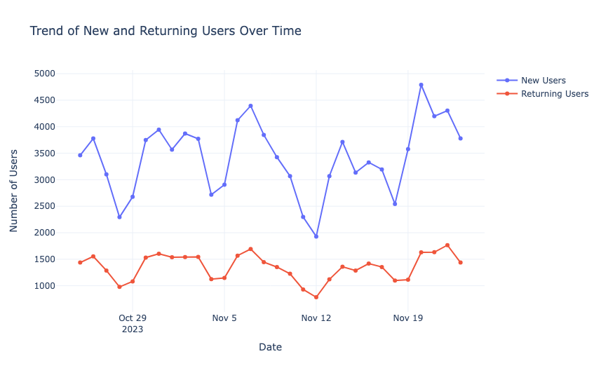
Now, let’s have a look at the trend of duration over time:
fig = px.line(data_frame=data, x='Date', y=['Duration Day 1', 'Duration Day 7'], markers=True, labels={'value': 'Duration'})
fig.update_layout(title='Trend of Duration (Day 1 and Day 7) Over Time', xaxis_title='Date', yaxis_title='Duration', xaxis=dict(tickangle=-45))
fig.show()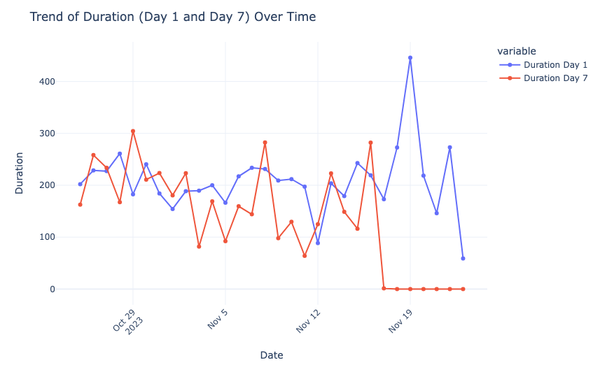
Now, let’s have a look at the correlation between the variables:
import seaborn as sns
import matplotlib.pyplot as plt

# Correlation matrix
correlation_matrix = data.corr()

# Plotting the correlation matrix
plt.figure(figsize=(10, 8))
sns.heatmap(correlation_matrix, annot=True, cmap='coolwarm', fmt=".2f")
plt.title('Correlation Matrix of Variables')
plt.show()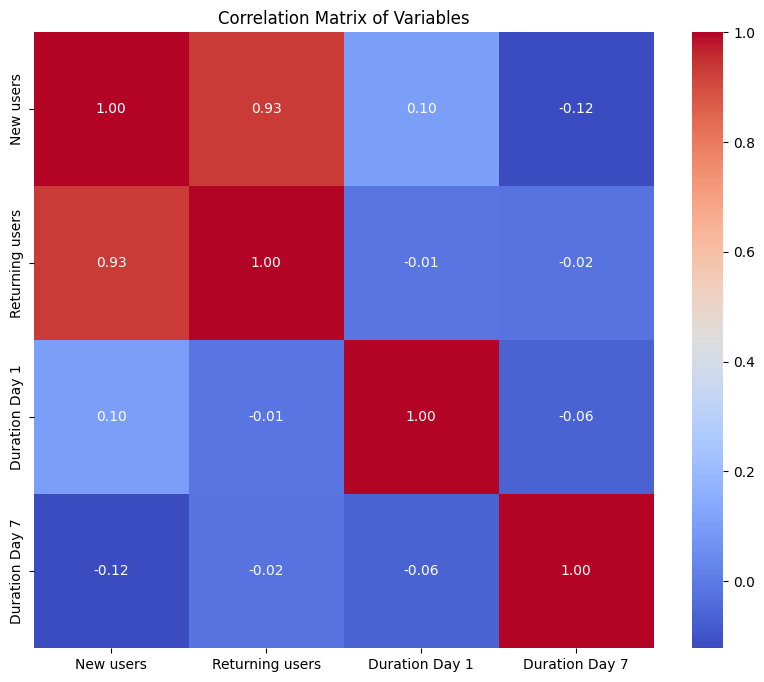
Here, the strongest correlation is between the number of new and returning users, indicating a potential trend of new users converting to returning users.
Now Here’s How to Perform Cohort Analysis using Python
For the task of Cohort Analysis, we’ll group the data by the week of the year to create cohorts. Then, for each cohort (week), we’ll calculate the average number of new and returning users, as well as the average of Duration Day 1 and Duration Day 7. Let’s start by grouping the data by week and calculating the necessary averages:
# Grouping data by week
data['Week'] = data['Date'].dt.isocalendar().week
# Calculating weekly averages
weekly_averages = data.groupby('Week').agg({
'New users': 'mean',
'Returning users': 'mean',
'Duration Day 1': 'mean',
'Duration Day 7': 'mean'
}).reset_index()
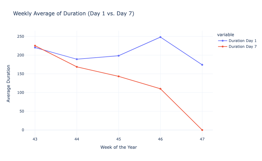
print(weekly_averages.head())Week New users Returning users Duration Day 1 Duration Day 7 0 43 3061.800000 1267.800000 220.324375 225.185602 1 44 3503.571429 1433.142857 189.088881 168.723200 2 45 3297.571429 1285.714286 198.426524 143.246721 3 46 3222.428571 1250.000000 248.123542 110.199609 4 47 4267.750000 1616.250000 174.173330 0.000000
Now, let’s have a look at the weekly average of the new and returning users and the duration:
fig1 = px.line(weekly_averages, x='Week', y=['New users', 'Returning users'], markers=True,
               labels={'value': 'Average Number of Users'}, title='Weekly Average of New vs. Returning Users')
fig1.update_xaxes(title='Week of the Year')
fig1.update_yaxes(title='Average Number of Users')

fig2 = px.line(weekly_averages, x='Week', y=['Duration Day 1', 'Duration Day 7'], markers=True,
               labels={'value': 'Average Duration'}, title='Weekly Average of Duration (Day 1 vs. Day 7)')
fig2.update_xaxes(title='Week of the Year')
fig2.update_yaxes(title='Average Duration')

fig1.show()
fig2.show()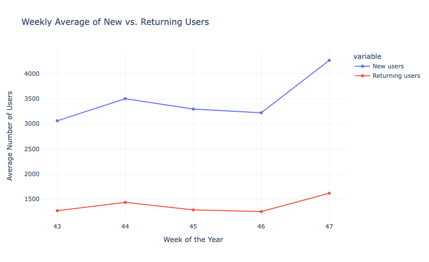
Now, let’s create a cohort chart to understand the cohort matrix of weekly averages. In the cohort chart, each row will correspond to a week of the year, and each column will represent a different metric:
- Average number of new users.
- Average number of returning users.
- Average duration on Day 1.
- Average duration on Day 7.
# Creating a cohort matrix
cohort_matrix = weekly_averages.set_index('Week')

# Plotting the cohort matrix
plt.figure(figsize=(12, 8))

sns.heatmap(cohort_matrix, annot=True, cmap='coolwarm', fmt=".1f")
plt.title('Cohort Matrix of Weekly Averages')
plt.ylabel('Week of the Year')
plt.show()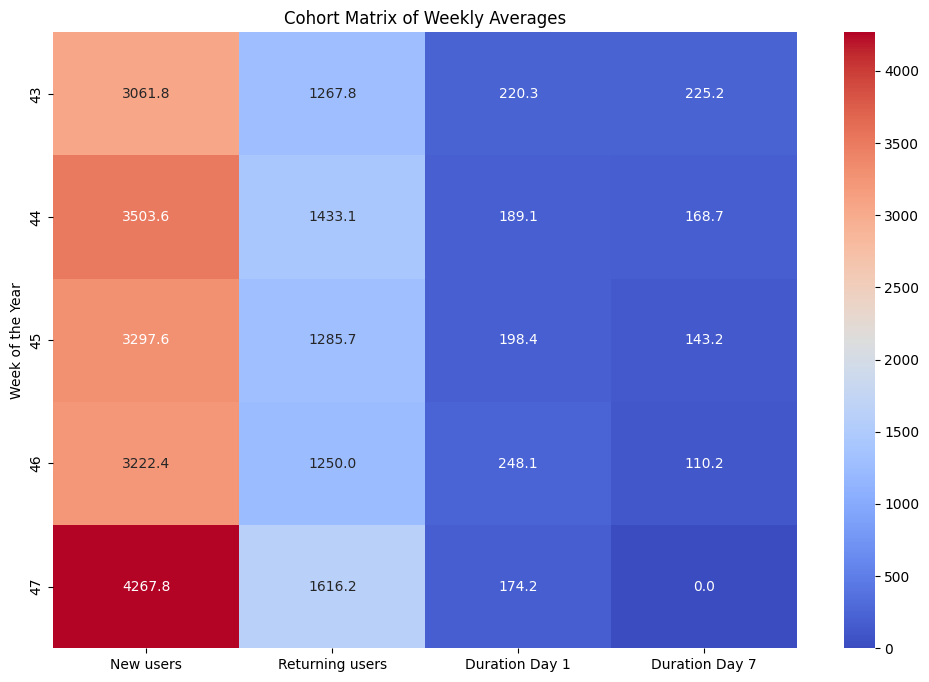
We can see that the number of new users and returning users fluctuates from week to week. Notably, there was a significant increase in both new and returning users in Week 47. The average duration of user engagement on Day 1 and Day 7 varies across the weeks. The durations do not follow a consistent pattern about the number of new or returning users, suggesting that other factors might be influencing user engagement.
Summary
Cohort Analysis is a data analysis technique used to gain insights into the behaviour and characteristics of specific groups of users or customers over time. It is valuable for businesses as it allows them to understand user behaviour in a more granular and actionable way. I hope you liked this article on Cohort Analysis using Python. Feel free to ask valuable questions in the comments section below.