Price Elasticity of Demand Analysis with Python
Price Elasticity of Demand (PED) measures the responsiveness of the quantity demanded of a product to changes in its price. It is calculated as the percentage change in quantity demanded divided by the percentage change in price. If you want to understand how to calculate and analyze the price elasticity of demand and how to make pricing decisions, this article is for you. In this article, I’ll take you through the price elasticity of demand analysis with Python.
Price Elasticity of Demand Analysis: Overview
Price Elasticity of Demand (PED) measures the responsiveness of the quantity demanded of a product to changes in its price. It is calculated as the percentage change in quantity demanded divided by the percentage change in price. It helps businesses understand how sensitive their customers are to price changes, which enables them to make informed pricing decisions.
For instance, if demand is highly elastic (PED > 1), a small price reduction can lead to a significant increase in sales, which will potentially boost revenue. Conversely, if demand is inelastic (PED < 1), the business can increase prices with minimal impact on sales volume, thereby increasing profit margins.
So, to analyze the price elasticity of demand, we need data about the price of a product and its sales over time. I found an ideal dataset for this task. You can download the dataset from here.
Price Elasticity of Demand Analysis with Python
Now, let’s get started with price elasticity of demand analysis by importing the necessary Python libraries and the dataset:
import pandas as pd
import plotly.express as px
import plotly.graph_objects as go

data = pd.read_csv("Competition_Data.csv")

print(data.head())
Index Fiscal_Week_ID Store_ID Item_ID Price Item_Quantity \
0 0 2019-11 store_459 item_526 134.49 435
1 1 2019-11 store_459 item_526 134.49 435
2 2 2019-11 store_459 item_526 134.49 435
3 3 2019-11 store_459 item_526 134.49 435
4 4 2019-11 store_459 item_526 134.49 435
Sales_Amount_No_Discount Sales_Amount Competition_Price
0 4716.74 11272.59 206.44
1 4716.74 11272.59 158.01
2 4716.74 11272.59 278.03
3 4716.74 11272.59 222.66
4 4716.74 11272.59 195.32
Now, let’s calculate the price elasticity of demand:
# calculate the percentage change in price and quantity
data['Price_Change'] = data.groupby(['Store_ID', 'Item_ID'])['Price'].pct_change()
data['Quantity_Change'] = data.groupby(['Store_ID', 'Item_ID'])['Item_Quantity'].pct_change()

# calculate the price elasticity of demand
data['PED'] = data['Quantity_Change'] / data['Price_Change']

data.replace([float('inf'), -float('inf')], float('nan'), inplace=True)
data.dropna(subset=['PED'], inplace=True)

# summary statistics for PED
ped_summary = data['PED'].describe()

ped_summary
In the above code, we first calculated the Price Elasticity of Demand (PED) for products in a dataset by first computing the percentage change in both the price (Price_Change) and quantity sold (Quantity_Change) for each product within each store. Then, we calculated the PED as the ratio of the percentage change in quantity to the percentage change in price.
The mean PED is approximately -0.35, which indicates that on average, the demand is slightly inelastic, meaning a 1% increase in price results in a 0.35% decrease in quantity demanded.
Now, let’s have a look at the relationship between the price changes and the change in the quantity demanded in the market:
fig_scatter = px.scatter(data, x='Price_Change', y='Quantity_Change', title='Price Change vs Quantity Change',
                         labels={'Price_Change': 'Price Change (%)', 'Quantity_Change': 'Quantity Change (%)'})
fig_scatter.update_traces(marker=dict(color='green', opacity=0.5))
fig_scatter.update_layout(xaxis_title='Price Change (%)', yaxis_title='Quantity Change (%)',
                          template='plotly_white')
fig_scatter.show()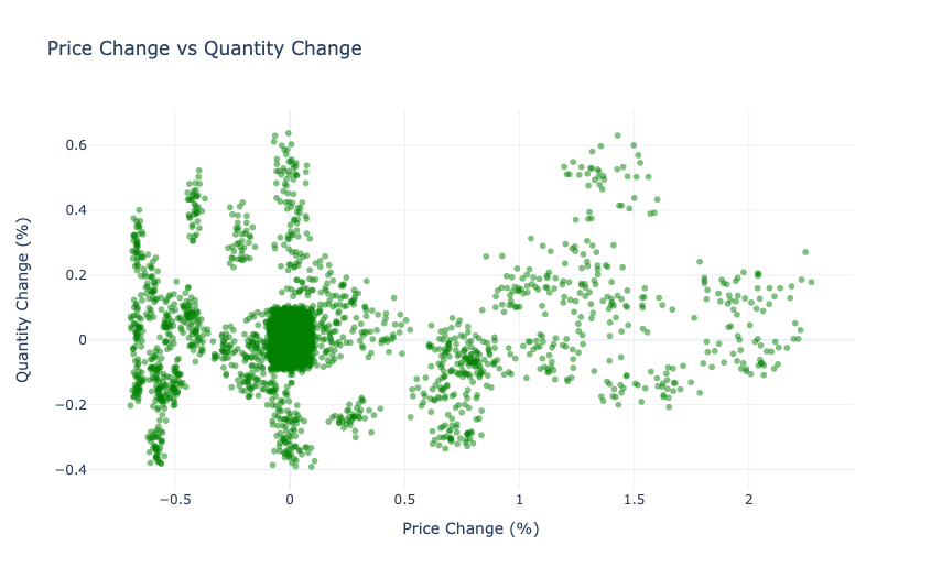
The scatter plot reveals that most data points are concentrated around the origin, which indicates that many products experience minimal changes in quantity demanded despite price changes. It suggests that the demand for these products is generally inelastic. However, there are also some points scattered further away from the origin, particularly in areas with positive price changes, which indicate that certain products have more elastic demand, where quantity responds more noticeably to price changes. Overall, the graph highlights a wide range of demand sensitivities across different products, with a general trend of inelasticity.
Now, let’s segment our market based on price elasticities:
# define PED thresholds for segmentation
elastic_threshold = 1
inelastic_threshold = -1

# segment the data based on PED
data['Segment'] = 'Unitary Elastic'
data.loc[data['PED'] > elastic_threshold, 'Segment'] = 'Highly Elastic'
data.loc[data['PED'] < inelastic_threshold, 'Segment'] = 'Inelastic'
data.loc[data['PED'] == 0, 'Segment'] = 'Zero Elasticity'
data.loc[data['PED'] < 0, 'Segment'] = 'Negative Elasticity'

# count the number of items in each segment
segment_counts = data['Segment'].value_counts()

segment_counts
Let’s visualize our segments to have a deep understanding:
fig_segment = px.scatter(data, x='Price_Change', y='Quantity_Change', color='Segment',
                         title='Price Change vs Quantity Change Across Different Market Segments',
                         labels={'Price_Change': 'Price Change (%)', 'Quantity_Change': 'Quantity Change (%)'},
                         color_continuous_scale='Viridis', opacity=0.6)

fig_segment.update_layout(xaxis_title='Price Change (%)', yaxis_title='Quantity Change (%)',
                          template='plotly_white')

fig_segment.show()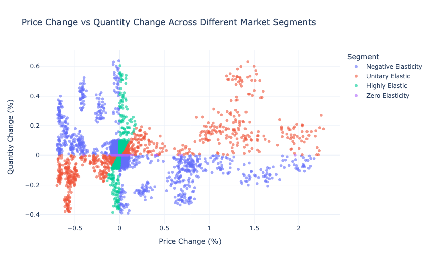
The graph depicts the relationship between price change (%) and quantity change (%) across different market segments categorized by elasticity. The segments include:
- Negative Elasticity (where price increases lead to quantity decreases)
- Unitary Elastic (where price changes result in proportionate quantity changes)
- Highly Elastic (where small price changes lead to significant quantity changes)
- and Zero Elasticity (where quantity remains unchanged despite price changes)
The scattered points show how each segment responds to price changes, with Negative Elasticity and Highly Elastic segments displaying more sensitivity, as seen in the wider spread of data points, while the Unitary Elastic and Zero Elasticity segments cluster more closely around the origin, indicating more stable or proportionate responses.
Here are concise pricing strategies for each segment identified in the graph:
- Negative Elasticity: Focus on reducing prices to stimulate demand, as consumers are sensitive to price increases. Price cuts can lead to significant increases in quantity sold, making up for lower margins.
- Unitary Elastic: Maintain stable pricing while focusing on improving product value or differentiating offerings. Since price changes lead to proportional quantity changes, the emphasis should be on balancing price with perceived value to maintain sales volume.
- Highly Elastic: Use dynamic pricing strategies, such as promotional discounts or price drops during peak demand periods, to capitalize on the high sensitivity of consumers to price changes. Small price reductions can lead to large increases in sales volume.
- Zero Elasticity: Price adjustments are less effective in driving sales changes for this segment. Focus on non-price strategies, such as improving product features, quality, or customer service, to differentiate and capture market share without relying on price changes.
So, this is how we can use the concept of price elasticity of demand for making pricing decisions.
Summary
Price Elasticity of Demand (PED) measures the responsiveness of the quantity demanded of a product to changes in its price. It is calculated as the percentage change in quantity demanded divided by the percentage change in price. It helps businesses understand how sensitive their customers are to price changes, which enables them to make informed pricing decisions.
I hope you liked this article on price elasticity of demand analysis with Python. Feel free to ask valuable questions in the comments section below. You can follow me on Instagram for many more resources.