Financial Data Analysis with Python
Financial data analysis involves examining financial information, such as stock prices, market trends, and company performance, to derive insights that support decision-making. We analyze metrics like volatility, returns, and various risk assessment methods. In this article, I’ll walk you through financial data analysis with Python, which will help you understand how to analyze financial data and make decisions based on it.
Financial Data Analysis: Overview and Data
This analysis aims to explore financial data from NIFTY50 stocks to uncover insights that can guide investment strategies and risk management decisions. The dataset consists of 24 days of historical closing prices for 50 stocks, with the Date column representing trading days. You can download the dataset from here.
The scope of the analysis includes calculating descriptive statistics to summarize stock behaviour, constructing and evaluating a portfolio for returns and risk, assessing volatility and Value at Risk (VaR), identifying trends through technical indicators like moving averages and Bollinger Bands, and forecasting future stock prices using Monte Carlo simulations.
Financial Data Analysis with Python
Now, let’s get started with financial data analysis by importing the dataset:
import pandas as pd

nifty50_data = pd.read_csv("/content/nifty50_closing_prices.csv")

nifty50_data.head()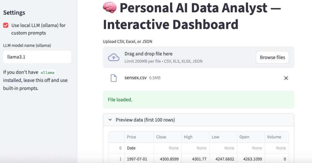
Let’s prepare a report on the columns that require data preparation steps:
# check for missing values
missing_values = nifty50_data.isnull().sum()

# check for date column format
date_format_check = pd.to_datetime(nifty50_data['Date'], errors='coerce').notna().all()

# check if the data has sufficient rows for time-series analysis
sufficient_rows = nifty50_data.shape[0] >= 20  # Minimum rows needed for rolling/moving averages

# preparing a summary of the checks
data_preparation_status = {
    "Missing Values in Columns": missing_values[missing_values > 0].to_dict(),
    "Date Column Format Valid": date_format_check,
    "Sufficient Rows for Time-Series Analysis": sufficient_rows
}

data_preparation_status
{'Missing Values in Columns': {'HDFC.NS': 24},
'Date Column Format Valid': True,
'Sufficient Rows for Time-Series Analysis': True}
The output indicates the following about the dataset:
- Missing Values: The HDFC.NS column has 24 missing values, meaning it is empty and requires removal or imputation.
- Date Column Validity: The Date column is in a valid datetime format, which ensures it can be used for time-series analysis.
- Sufficient Rows: The dataset contains enough rows to perform time-series calculations like moving averages and other analyses.
Now, let’s prepare the data:
# drop the HDFC.NS column since it contains 100% missing values
nifty50_data = nifty50_data.drop(columns=['HDFC.NS'])

# convert the 'Date' column to datetime format
nifty50_data['Date'] = pd.to_datetime(nifty50_data['Date'])

# sort the dataset by date to ensure proper time-series order
nifty50_data = nifty50_data.sort_values(by='Date')

# reset index for a clean dataframe
nifty50_data.reset_index(drop=True, inplace=True)
Now, let’s look at the descriptive statistics:
# calculate descriptive statistics
descriptive_stats = nifty50_data.describe().T  # Transpose for better readability
descriptive_stats = descriptive_stats[['mean', 'std', 'min', 'max']]
descriptive_stats.columns = ['Mean', 'Std Dev', 'Min', 'Max']
print(descriptive_stats)
Mean Std Dev Min Max
RELIANCE.NS 2976.912506 41.290551 2903.000000 3041.850098
HDFCBANK.NS 1652.339579 28.258220 1625.050049 1741.199951
ICICIBANK.NS 1236.770818 36.438726 1174.849976 1338.449951
INFY.NS 1914.558324 30.240685 1862.099976 1964.500000
TCS.NS 4478.349976 70.822718 4284.899902 4553.750000
KOTAKBANK.NS 1809.422918 32.936318 1764.150024 1904.500000
HINDUNILVR.NS 2845.333344 65.620694 2751.050049 2977.600098
ITC.NS 507.739581 5.472559 497.299988 519.500000
LT.NS 3647.099976 60.511574 3536.949951 3793.899902
SBIN.NS 802.233332 17.442330 768.599976 824.799988
BAJFINANCE.NS 7203.118754 306.658594 6722.200195 7631.100098
BHARTIARTL.NS 1572.574997 67.346274 1449.150024 1711.750000
HCLTECH.NS 1753.743744 46.874886 1661.449951 1813.750000
ASIANPAINT.NS 3231.654175 88.793647 3103.199951 3383.250000
AXISBANK.NS 1191.879155 27.369408 1158.750000 1245.000000
DMART.NS 5143.058329 155.593701 4901.500000 5361.399902
MARUTI.NS 12320.356201 109.587342 12145.750000 12614.500000
ULTRACEMCO.NS 11472.318807 172.673053 11200.900391 11798.299805
TITAN.NS 3654.899974 95.697721 3474.899902 3797.199951
SUNPHARMA.NS 1819.299993 34.792913 1750.650024 1866.099976
M&M.NS 2763.954183 56.045817 2654.250000 2950.850098
NESTLEIND.NS 2539.102081 46.123738 2492.500000 2699.550049
WIPRO.NS 529.764582 11.824190 512.400024 551.900024
ADANIGREEN.NS 1891.595835 54.031206 1788.199951 2003.949951
TATASTEEL.NS 152.277083 1.893183 148.169998 155.699997
JSWSTEEL.NS 943.729167 15.778456 917.150024 981.549988
POWERGRID.NS 335.285414 3.013865 328.549988 340.850006
ONGC.NS 309.819995 16.989364 285.250000 330.750000
NTPC.NS 407.133334 8.990767 389.649994 423.950012
COALINDIA.NS 507.735413 20.470753 477.950012 538.849976
BPCL.NS 347.529167 9.011248 324.450012 360.700012
IOC.NS 173.630416 3.702380 165.039993 181.339996
TECHM.NS 1626.229172 21.236330 1579.199951 1656.050049
INDUSINDBK.NS 1428.679164 33.914618 1381.300049 1484.750000
DIVISLAB.NS 5171.531250 247.674895 4723.149902 5498.649902
GRASIM.NS 2718.235443 35.912080 2636.699951 2784.350098
CIPLA.NS 1627.025004 29.773691 1562.849976 1671.800049
BAJAJFINSV.NS 1796.470825 99.422795 1602.099976 1916.800049
TATAMOTORS.NS 1044.662498 52.496391 962.049988 1121.650024
HEROMOTOCO.NS 5619.377096 247.092728 5244.399902 6013.250000
DRREDDY.NS 6785.795817 175.124908 6502.549805 7062.450195
SHREECEM.NS 25299.906169 429.919834 24692.199219 26019.650391
BRITANNIA.NS 5935.202026 144.164343 5703.350098 6210.549805
UPL.NS 596.343750 16.975821 566.150024 619.200012
EICHERMOT.NS 4863.831258 68.442418 4726.649902 4963.149902
SBILIFE.NS 1849.331243 43.189734 1761.300049 1928.650024
ADANIPORTS.NS 1462.916677 26.223794 1408.199951 1503.500000
BAJAJ-AUTO.NS 10999.654134 659.810841 9779.700195 11950.299805
HINDALCO.NS 681.885417 15.952804 647.700012 711.849976
Portfolio Analysis
Portfolio Analysis is the process of evaluating the performance of a collection of financial assets (a portfolio) to understand its returns, risks, and overall behaviour. It helps investors optimize asset allocation to achieve specific financial goals. Let’s perform a portfolio analysis:
# assign weights to a subset of stocks (example: RELIANCE.NS, HDFCBANK.NS, ICICIBANK.NS)
weights = [0.4, 0.35, 0.25]
portfolio_data = nifty50_data[['RELIANCE.NS', 'HDFCBANK.NS', 'ICICIBANK.NS']]

# calculate daily returns
daily_returns = portfolio_data.pct_change().dropna()

# calculate portfolio returns
portfolio_returns = (daily_returns * weights).sum(axis=1)

# display portfolio returns
portfolio_returns.head()
So, in the above code, we:
- Selected three stocks (RELIANCE, HDFCBANK, ICICIBANK) to form a portfolio.
- Assigned weights of 40%, 35%, and 25%, which represent the proportion of investment in each stock.
- Computed the percentage change in daily prices for each stock.
- Calculated weighted daily portfolio returns by multiplying individual stock returns by their respective weights and summing them.
In the output, each value represents the percentage change in the portfolio’s value for a particular day. For example, a return of -0.002790 on the first day indicates a 0.279% decrease in the portfolio’s value, while 0.004495 on the second day indicates a 0.4495% increase. These values help in tracking the portfolio’s daily performance over time.
Risk Assessment
Risk Assessment is the process of evaluating the potential risks in an investment, such as price volatility and potential losses, to help investors make informed decisions. Let’s perform a risk assessment:
# Calculate standard deviation (volatility)
volatility = daily_returns.std()

# Calculate VaR (95% confidence level)
confidence_level = 0.05
VaR = daily_returns.quantile(confidence_level)

# Display risk metrics
risk_metrics = pd.DataFrame({'Volatility (Std Dev)': volatility, 'Value at Risk (VaR)': VaR})
print(risk_metrics)
To perform risk assessment, we:
- Calculated the standard deviation of daily returns for each stock, to measure how much the stock prices fluctuate.
- Computed the 5th percentile (95% confidence level) of daily returns, to estimate the maximum loss the portfolio could experience on a bad day.
              Volatility (Std Dev)  Value at Risk (VaR)
RELIANCE.NS               0.008708            -0.013624
HDFCBANK.NS               0.006901            -0.005987
ICICIBANK.NS              0.011594            -0.008577
The results show the risk metrics for three stocks in the portfolio:
- Volatility (Std Dev): RELIANCE has a volatility of 0.87%, HDFCBANK has 0.69%, and ICICIBANK has 1.16%. This indicates that ICICIBANK has the highest price fluctuations, while HDFCBANK is the least volatile.
- Value at Risk (VaR): At a 95% confidence level, RELIANCE has a maximum potential daily loss of 1.36%, HDFCBANK has 0.60%, and ICICIBANK has 0.86%. These values indicate the risk of loss for each stock in a single day under normal market conditions.
Correlation Analysis
Correlation Analysis examines the relationship between the returns of different assets to determine how they move relative to each other. A positive correlation indicates that the assets tend to move in the same direction, while a negative correlation means they move in opposite directions. Let’s perform a correlation analysis:
import plotly.figure_factory as ff

# calculate correlation matrix
correlation_matrix = daily_returns.corr()

fig = ff.create_annotated_heatmap(
    z=correlation_matrix.values,
    x=list(correlation_matrix.columns),
    y=list(correlation_matrix.index),
    annotation_text=correlation_matrix.round(2).values,
    colorscale='RdBu',
    showscale=True
)

fig.update_layout(
    title="Correlation Matrix of Stock Returns",
    title_x=0.5,
    font=dict(size=12),
    plot_bgcolor='white',
    paper_bgcolor='white',
)

fig.show()
So, in the above code, we:
- Calculated the pairwise correlation coefficients for the daily returns of the selected stocks, to show the strength and direction of their relationships.
- Used a heatmap to visually represent the correlations, with colour intensities indicating the strength of the relationships.
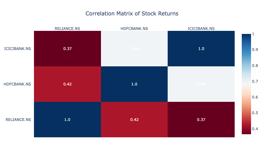
The correlation matrix shows the relationships between the daily returns of three stocks:
- RELIANCE and HDFCBANK have a moderate positive correlation of 0.42, indicating they often move in the same direction but not perfectly.
- ICICIBANK and HDFCBANK have a higher correlation of 0.69, suggesting stronger co-movement.
- RELIANCE and ICICIBANK have a lower correlation of 0.37, indicating relatively weaker alignment.
Moving Averages
Moving Averages are a technical analysis tool that smooths out price data by calculating the average price over a specific period. They help identify trends by reducing short-term fluctuations in stock prices. Let’s calculate the moving averages:
import plotly.graph_objects as go

# calculate moving averages for RELIANCE
nifty50_data['RELIANCE_5d_MA'] = nifty50_data['RELIANCE.NS'].rolling(window=5).mean()
nifty50_data['RELIANCE_20d_MA'] = nifty50_data['RELIANCE.NS'].rolling(window=20).mean()

fig = go.Figure()

fig.add_trace(go.Scatter(
    x=nifty50_data['Date'],
    y=nifty50_data['RELIANCE.NS'],
    mode='lines',
    name='RELIANCE.NS Price'
))

fig.add_trace(go.Scatter(
    x=nifty50_data['Date'],
    y=nifty50_data['RELIANCE_5d_MA'],
    mode='lines',
    name='5-Day MA'
))

fig.add_trace(go.Scatter(
    x=nifty50_data['Date'],
    y=nifty50_data['RELIANCE_20d_MA'],
    mode='lines',
    name='20-Day MA'
))

fig.update_layout(
    title="Moving Averages for RELIANCE.NS",
    xaxis_title="Date",
    yaxis_title="Price",
    template="plotly_white",
    legend=dict(title="Legend")
)

fig.show()
To calculate the moving averages, we:
- Calculated the 5-day and 20-day moving averages for RELIANCE to represent short-term and medium-term trends.
- Plotted the actual price of RELIANCE along with its 5-day and 20-day moving averages to visualize how the stock price interacts with these trend lines.
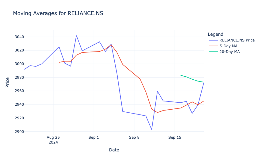
The result shows that the 5-day moving average (red line) closely follows the short-term price fluctuations, while the 20-day moving average (green line) provides a smoother trend. When the price crosses above or below these moving averages, it may indicate potential buy or sell signals. For example, a downward trend is visible as the stock price falls below the 20-day moving average, which suggests bearish momentum during that period.
Relative Strength Index (RSI)
Relative Strength Index (RSI) is a momentum oscillator that measures the speed and change of price movements, ranging from 0 to 100. It helps identify overbought (RSI > 70) or oversold (RSI < 30) conditions in a stock, to signal potential buy or sell opportunities. Let’s calculate RSI:
# RSI calculation function
def calculate_rsi(prices, window=14):
    delta = prices.diff()
    gain = (delta.where(delta > 0, 0)).rolling(window=window).mean()
    loss = (-delta.where(delta < 0, 0)).rolling(window=window).mean()
    rs = gain / loss
    rsi = 100 - (100 / (1 + rs))
    return rsi

# calculate RSI for RELIANCE
nifty50_data['RELIANCE_RSI'] = calculate_rsi(nifty50_data['RELIANCE.NS'])

fig = go.Figure()

fig.add_trace(go.Scatter(
    x=nifty50_data['Date'],
    y=nifty50_data['RELIANCE_RSI'],
    mode='lines',
    name='RSI'
))

fig.add_trace(go.Scatter(
    x=nifty50_data['Date'],
    y=[70] * len(nifty50_data['Date']),
    mode='lines',
    line=dict(color='red', dash='dash'),
    name='Overbought (70)'
))

fig.add_trace(go.Scatter(
    x=nifty50_data['Date'],
    y=[30] * len(nifty50_data['Date']),
    mode='lines',
    line=dict(color='green', dash='dash'),
    name='Oversold (30)'
))

fig.update_layout(
    title="RSI for RELIANCE.NS",
    xaxis_title="Date",
    yaxis_title="RSI",
    template="plotly_white",
    legend=dict(title="Legend")
)

fig.show()
So, in the above code, we:
- Used a 14-day window to compute RSI for RELIANCE, based on average gains and losses over that period.
- Plotted the RSI values along with horizontal lines at 70 (overbought threshold) and 30 (oversold threshold) to indicate key trading signals.
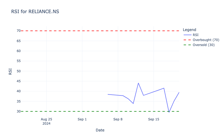
In the above output, the RSI values range between 30 (oversold, green dashed line) and 70 (overbought, red dashed line). In the observed period, the RSI remains mostly below 50, which indicates weaker momentum and no overbought conditions. Around mid-September, the RSI briefly drops close to the oversold region, which signals potential buying opportunities before recovering.
Sharpe Ratio
Sharpe Ratio is a measure of risk-adjusted return that indicates how much excess return an investment generates for each unit of risk taken. It is calculated by subtracting the risk-free rate from the mean returns and dividing the result by the investment’s volatility (standard deviation). Let’s calculate the Sharpe ratio:
import numpy as np

# calculate average returns and volatility
mean_returns = daily_returns.mean()
volatility = daily_returns.std()

# assume a risk-free rate
risk_free_rate = 0.04 / 252

# calculate sharpe ratio
sharpe_ratios = (mean_returns - risk_free_rate) / volatility

table_data = pd.DataFrame({
    'Stock': sharpe_ratios.index,
    'Sharpe Ratio': sharpe_ratios.values.round(2)
})

fig = go.Figure(data=[go.Table(
    header=dict(values=['Stock', 'Sharpe Ratio'],
                fill_color='paleturquoise',
                align='left'),
    cells=dict(values=[table_data['Stock'], table_data['Sharpe Ratio']],
               fill_color='lavender',
               align='left')
)])

fig.update_layout(
    title="Sharpe Ratios for Selected Stocks",
    template="plotly_white"
)

fig.show()
In the above code, we:
- Calculated the average daily returns and volatility for the selected stocks.
- Assumed a daily risk-free rate (e.g., 0.04/252 for annualized rate).
- Computed the ratio using the formula (Mean Returns − Risk-Free Rate) / Volatility.
- Displayed the Sharpe Ratios in a tabular format using Plotly.
The results show the Sharpe Ratios for the selected stocks:
- RELIANCE.NS: A negative Sharpe Ratio (-0.05) suggests that the stock’s returns are lower than the risk-free rate, which makes it less attractive from a risk-adjusted perspective.
- HDFCBANK.NS: A Sharpe Ratio of 0.37 indicates moderate risk-adjusted returns.
- ICICIBANK.NS: With a Sharpe Ratio of 0.47, it provides the best risk-adjusted returns among the three stocks.
Monte Carlo Simulation
Monte Carlo Simulation is a statistical method used to model and predict the probability of different outcomes by running multiple simulations of random variables. It is commonly used in finance to estimate potential future price movements of stocks under uncertainty. Let’s use the Monte Carlo Simulation:
# monte carlo simulation for RELIANCE
num_simulations = 1000
num_days = 252
last_price = nifty50_data['RELIANCE.NS'].iloc[-1]
simulated_prices = np.zeros((num_simulations, num_days))
volatility = nifty50_data['RELIANCE.NS'].pct_change().std()

for i in range(num_simulations):
    simulated_prices[i, 0] = last_price
    for j in range(1, num_days):
        simulated_prices[i, j] = simulated_prices[i, j - 1] * np.exp(
            np.random.normal(0, volatility)
        )

fig = go.Figure()

for i in range(num_simulations):
    fig.add_trace(go.Scatter(
        x=list(range(num_days)),
        y=simulated_prices[i],
        mode='lines',
        line=dict(width=0.5),
        opacity=0.1,
        showlegend=False
    ))

fig.update_layout(
    title="Monte Carlo Simulation for RELIANCE.NS Prices",
    xaxis_title="Days",
    yaxis_title="Simulated Price",
    template="plotly_white"
)

fig.show()
In the above code, we:
- Generated 1,000 possible price paths for RELIANCE.NS over 252 trading days using its historical volatility.
- Used normally distributed random returns to simulate how the stock price might evolve from its last observed value.
- Plotted all simulation paths to visualize the range of potential future prices.
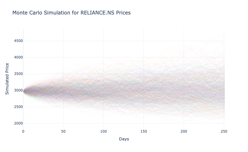
In the above output, each line represents a possible future price trajectory, starting from the last observed price. The spread of the paths widens over time, which reflects increasing uncertainty as the prediction horizon extends. This visualization highlights the range of possible price outcomes, which helps assess risk and the likelihood of extreme scenarios for the stock.
So, this is how you can perform financial data analysis with Python.